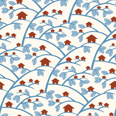
Naked & Angry makes beautiful neckties in small editions, based on a community-driven submission-and-ranking system. They're owned by SkinnyCorp, explaining the Threadless-esque mechanics of the voting process. We're not crazy about the five currently in production, but we've got huge hopes that Lara Cameron's Treehouses (shown above) is turned into a piece of neckwear.
 3 Comments
 Design, Fashion
 Permalink
Presented without comment:
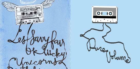
Left: Poster by Yo Rodeo for Les Savy Fav, 2003
Right: T-shirt design by Unborn Media for PureVolume, 2006
2 Comments
Art, Design
Permalink
Though it's less acute in our Kingston place than it was in Montreal, we've had a tendancy to find housing that features long, narrow hallways. Our hallway in Montreal, some thirty feet of hardwood, was jokingly referred to as the Bowling Alley.
So we liked the idea of Flor, a flexible and modular carpeting solution.
But we loved this even more: DIY, cheap as water, and charmingly ragtag:
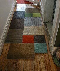
Okay, so truth be told we'd probably hunt for bolder colours and try to square it off (call us conventional), but Faux Flor is still pretty durn'd cool.
No Comments »
Design
Permalink
Ray Fenwick is a Haligonian who makes lovely screenprinted posters, a weekly comic in The Coast, and other art-and-design miscellanea. We particularly liked his More More More diamond, a submission to the t-shirt competition on Threadless:

But what really caught our eye was the zany humour and gorgeous lettering of his series, The Slow Jams of L.L. Cool J. The series seems to know that no amount of brilliant hand lettering can lend gravitas or legitimacy to the over-the-top schlock of a LL love song, and consequentally just embraces the schlock:

(Via)
1 Comment
Art, Design
Permalink
Those who know us, know that we are not much for postal mail. Our only interaction with Canada Post comes when we intermittantly deposit our Zip discs in the cherry-red neighbourhood postbox. And when our latest eBizzle purchases arrive. So, we're not confident that a mere stamp would be enough to rekindle a long-dead love affair with snail mail. But if a stamp could, this would be it (via):

The stamp uses letter forms from Canadian designer Carl Dair's 'Cartier' typeface to form a highly stylized beaver which (to our thinking) feels inspired by Tlingit or Haida art. It's beautiful and has undeniable typography-nerd appeal. Could there be anything better?
2 Comments
Design
Permalink


 Older Entries